This blog post is part of a series describing my ongoing analysis of the Kaggle Horses For Courses data set using Azure Data Lake Analytics with U-SQL and Azure Notebooks with F#. This is part 2.
- Horses For Courses data set analysis with Azure Data Lake and U-SQL
- Horses For Courses barrier analysis with Azure Notebooks (this blog post)
- Kaggle Horses for Courses age analysis with Azure Notebooks
- Kaggle Horses for Courses analysis of last five starts with Azure Notebooks
Data set and recap
A quick recap of Kaggle and the data set we're analyzing: Horses For Courses. Kaggle is a data science and machine learning community that hosts a number of data sets and machine learning competitions, some of which with prize money. 'Horses For Courses' is a (relatively small) data set of anonymized horse racing data. In the previous post I discussed how you could use Azure Data Lake Analytics and U-SQL to analyze and process the data. I used this mainly to generate new data files that can then be used for further analysis.
The first file I created, based on the source data, was a file called barriers.csv. It contains, for each race, the starting barrier for each pair of two horses in the race and which horse finished before the other horse. I am now going to analyze this file using Azure Notebooks with an F# kernel.
Azure Notebooks
You may now wonder, what is he talking about?! So hang on and let me explain. An Azure Notebook is a way of sharing and running code on the internet. A number of programming languages are supported like Python, R and F#. A programming language in a notebook is supported via a kernel and in my case I use the F# kernel.
Azure Notebooks isn't exactly new technology because it's an implementation of Jupyter Notebooks. Jupyter evolved as a way to do rapid online interactive data analysis and visualization, which is exactly what I'm going to do with my barriers.csv file.
Barriers notebook
The largest part of this post is actually inside the notebook itself, so let me give you the link to my notebook library. At the time of writing there is one notebook there: Barriers.ipynb. You can run this notebook by clicking on it and logging in with a Microsoft account (formerly known as Live account).
When you do that, the library is cloned (don't worry, it's free) and you can run the notebook. The most important thing to remember if you want to run an Azure (or Jupyter) notebook is the key combination Shift+Enter. It executes the current notebook cell and moves to the next cell.
I invite you to run the notebook now to see what the data looks like and how it is analyzed. It takes about five minutes. But if you do not have time or do not feel like cloning and running an Azure notebook, I will provide the summary here.
We have a data set of about half a million rows with two barriers and a flag indicating who won on each row. These are grouped together to determine for every barrier, how often starting from that barrier resulted in a win. The final result of this step is shown below (for 13 barriers):
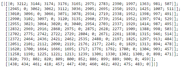
On the first row, we see that barrier 1 beats barrier 2 3212 times. It beats barrier 3 3144 times, etc. You can immediately spot a problem with this data. We would expect that starting from a lower barrier gives you an advantage. However, for example, barrier 1 beats barrier 12 only 981 times. Reason for this is that there are less horse races with 12 horses than there are with 6 horses, for example.
We need the relative instead of the absolute numbers: the win-loss ratio per barrier combination. So we divide the number of times barrier x beats barrier y by the number of times barrier y beats barrier x. The result is below (for 6 barriers this time so everything fits nicely on a row).
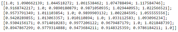
You can see that barrier 1 gives positive win-loss ratios against all other barriers. To make this even more clear, let's visualize the data (for the first 14 barriers).
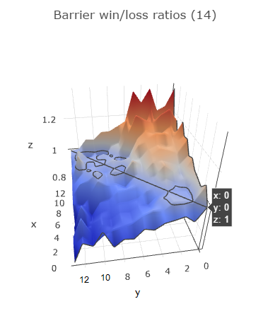
I hope I found the right angle that makes the visualization the easiest to understand. In the notebook it is interactive so you can turn it around and zoom in. The diagonal line represents barriers racing against themselves so this is always 1. Behind this diagonal the graph rises up, indicating positive win-loss ratios. The graph comes down in front of the diagonal, indicating negative win-loss ratios.
The y-axis represents the first barrier, the x-axis the second barrier. So if you take a look at y = 0 (barrier 1), you can see it has a positive win-loss ratio against all other barriers (all x values). If you look at y=6 (barrier 7), it has a negative win-loss ratio against x = 0..5 (barriers 1 through 6) and a positive win-loss ratio against x = 7..13 (barriers 8 through 14).
The same is true for almost all barriers, indicating that it's better to start from a lower barrier: it definitely increases your chances of winning the race.
However, it is definitely not the only feature we need to predict finishing positions in a race. Even though barrier 4 beats barrier 8 2739 times, barrier 8 also beats barrier 4 2421 times. We need to find additional features in the data set if we want to make accurate predictions. That's a topic for a future post.